AzamSharp
The Ultimate Guide to Validation Patterns in SwiftUI
Validation is a crucial component of app development, ensuring that only accurate and meaningful data is processed by your application. As the saying goes in software development, Garbage in, garbage out. If your app allows users to submit invalid data, it will inevitably result in unreliable and flawed outputs.
In this article, we will explore various techniques for implementing robust validation in your SwiftUI apps to enhance data integrity and user experience.
Simple Validation
Validation doesn’t have to be overly complex. The primary goal is to inform users when their input is invalid and guide them to correct it. This can be achieved in various ways, such as showing error messages, highlighting fields, or enabling/disabling certain actions.
In the following example, we demonstrate a simple implementation of a login screen. Basic validation is used to ensure that both the username and password fields are filled. If either field is empty, the “Login” button will remain disabled, providing clear feedback to the user about the required input.
struct LoginScreen: View {

    @State private var username: String = ""
    @State private var password: String = ""

    private var isFormValid: Bool {
        return !username.isEmptyOrWhitespace && !password.isEmptyOrWhitespace
    }

    var body: some View {
        Form {
            TextField("Username", text: $username)
            TextField("Password", text: $password)
            Button("Login") {

            }.disabled(!isFormValid)
        }

    }
}
In straightforward scenarios like this, explicit error messages may not be necessary. The user can clearly see that they cannot proceed without providing valid credentials, thanks to the disabled state of the “Login” button. This immediate feedback reduces cognitive load and keeps the interaction intuitive.
Additionally, the choice of user interface components plays a crucial role in preventing invalid input. By designing input fields and controls that guide users toward valid entries, we can minimize the chances of errors. For example, dropdown menus, date pickers, or stepper controls inherently restrict input to valid options, ensuring a smoother user experience.
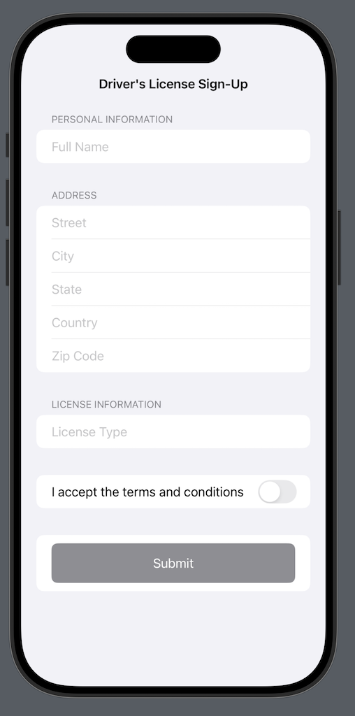
Take a look at the following screenshot:

At first glance, the form appears to be well-designed. However, upon closer inspection, there is a significant risk that users might provide incorrect input for critical fields like state, license type, and country. These fields often play a crucial role in processing and validation, making accurate data essential.
While similar concerns can be raised for fields like street, city, and zip code, these generally have a lower impact on the overall process in most cases. However, if these fields are critical to the app’s functionality—such as for location-based services or accurate delivery—it would be beneficial to integrate the form with Google Location Services or a similar geocoding API. This ensures the data entered is validated and aligned with real-world locations, improving accuracy and reliability.
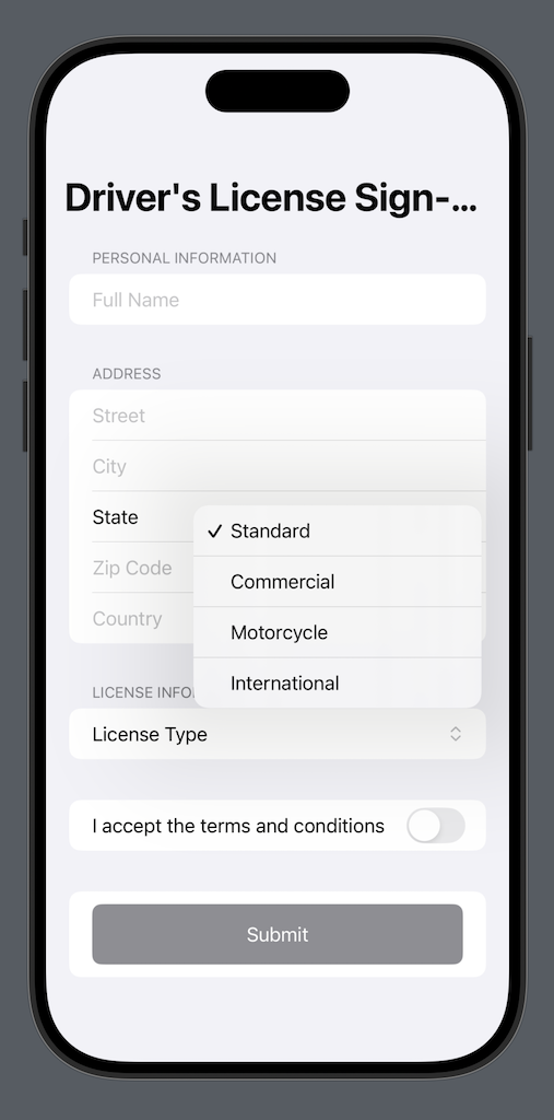
A straightforward and effective solution would be to replace the text input with a user interface component, such as a dropdown menu or picker, that allows users to select an option from predefined choices. This approach minimizes errors, ensures data consistency, and provides a more user-friendly experience.

The Driver License Sign-Up Form can greatly benefit from displaying error messages to the user. Since the form consists of multiple fields, each with specific requirements (e.g., format, type, or length), clear error messages help users understand and correct mistakes. This improves the overall user experience, reduces frustration, and ensures that the submitted data meets the necessary validation criteria.
In the next section, we will explore effective strategies for displaying a validation summary to users, ensuring they can easily identify and correct errors in the form. This approach enhances usability and ensures accurate data entry.
Validation Summary
A validation summary is an efficient way to display all form validation errors in a single location, enabling users to quickly review the issues and take appropriate action to correct them. This approach enhances usability by providing clear, consolidated feedback rather than scattering error messages throughout the form.
The simplest way to implement a validation summary is by maintaining a single array to track all validation errors. While you can use a custom type to represent error objects for more flexibility, starting with a straightforward array of strings is often sufficient for basic implementations.
@State private var validationErrors: [String] = [] // To store validation error messages
When the user submits the form by pressing the Submit button, we can trigger validation for the entire form. The validate function below handles this process by checking all form fields for compliance with their requirements. If any validation rules are violated, appropriate error messages are added to the validationErrors array.
 private func validate() -> Bool {
        validationErrors = [] // Clear previous errors

        // Validate each field
        if fullName.trimmingCharacters(in: .whitespaces).isEmpty {
            validationErrors.append("Full Name is required.")
        }
        if street.trimmingCharacters(in: .whitespaces).isEmpty {
            validationErrors.append("Street is required.")
        }
        if city.trimmingCharacters(in: .whitespaces).isEmpty {
            validationErrors.append("City is required.")
        }
        if selectedState.isEmpty {
            validationErrors.append("State is required.")
        }
        if zipCode.trimmingCharacters(in: .whitespaces).isEmpty || !zipCode.isValidZipCode {
            validationErrors.append("Zip Code must be in a valid format (e.g., 12345 or 12345-6789).")
        }
        if country.trimmingCharacters(in: .whitespaces).isEmpty {
            validationErrors.append("Country is required.")
        }
        if selectedLicenseType.isEmpty {
            validationErrors.append("License Type is required.")
        }
        if !agreementAccepted {
            validationErrors.append("You must accept the terms and conditions.")
        }

        return validationErrors.isEmpty

    }
If there are any errors then you can loop through the errors and display them. This is shown in the implementation below:
 Form {
                // Validation summary section
                if !validationErrors.isEmpty {
                    Section(header: Text("Validation Summary").foregroundColor(.red)) {
                        ForEach(validationErrors, id: \.self) { error in
                            Text(error).foregroundColor(.red)
                        }
                    }
                }
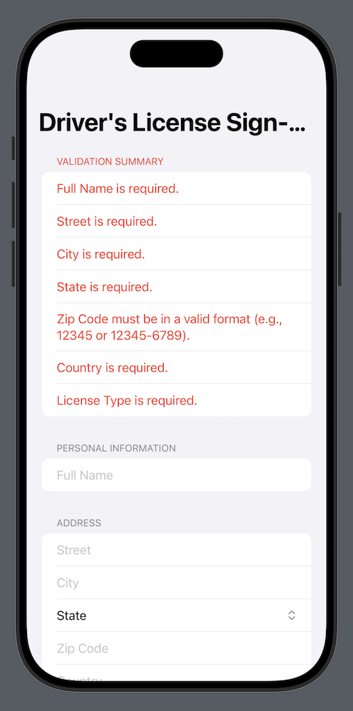
The result is shown below:

Now, the user can address the errors one by one. As each error is resolved, the user can reattempt submission until all issues are fixed and the form is successfully submitted. This iterative process ensures that the user has clear guidance to complete the form correctly.
It’s likely that you’ll need to display validation errors on other screens as well. To make your code more reusable and maintainable, you can extract this functionality into a standalone validation summary component, as shown below:
struct ValidationSummary: View {
    let validationErrors: [String]

    var body: some View {

        Section(header: Text("Validation Summary").foregroundColor(.red)) {
            ForEach(validationErrors, id: \.self) { error in
                Text(error)
                    .foregroundColor(.red)
            }
        }

    }
}
Feel free to customize validation summary control to fit your needs. This is a great opportunity to communicate with your designer and come up with an intuitive presentation of the validation error messages.
Custom Validation Views
A common approach to adding validation in SwiftUI views is to create custom controls, such as ValidateTextField or ValidatePicker, with built-in validation logic. However, this approach can quickly lead to a bloated and rigid codebase, as each input type would require a unique custom control.
A more efficient and scalable solution is to use view modifiers for validation. Instead of creating custom views from scratch, view modifiers allow you to extend existing SwiftUI components, like TextField or Picker, with validation capabilities in a reusable and consistent manner. This approach keeps your codebase cleaner, avoids duplication, and integrates seamlessly with SwiftUI’s declarative design, enabling flexible and maintainable validation logic across your app.
In the next section, we will explore how to implement a validator view modifier, inspired by Flutter’s validation approach. This modifier will allow you to seamlessly add validation logic to existing SwiftUI views, like TextField or Picker, without the need to create custom components from scratch. By following this approach, you can achieve a clean, reusable, and declarative way to handle validation across your SwiftUI application.
Inline Validation Error Messages (Inspired from Flutter)
SwiftUI is not the only declarative UI framework out there—React, Flutter, and Jetpack Compose also belong to the same family. As a SwiftUI developer, it’s beneficial to explore these platforms to learn alternative techniques for solving problems and expanding your perspective.
For example, Flutter provides built-in support for form validation by allowing developers to implement a validator function directly on TextField widgets. This function enables real-time input validation and feedback to the user, as demonstrated below:
TextFormField(
  // The validator receives the text that the user has entered.
  validator: (value) {
    if (value == null || value.isEmpty) {
      return 'Please enter some text';
    }
    return null;
  },
),
In this example, the validator function checks if the input is empty or does not match a specific email format. If validation fails, an error message is returned and displayed under the text field, showcasing Flutter’s straightforward approach to form validation.
We can draw inspiration from Flutter’s approach to form validation and implement similar behavior in SwiftUI using view modifiers. A good way to tackle this is by starting with the desired end result and working backward to the implementation.
Below is an example of how the validator view modifier might look at the calling site:
 TextField("Username", text: $username)
                .validator(
                    for: username,
                    field: "username", shouldValidate: shouldValidate, validationResults: $validationResults) { username in
                        if username.isEmpty {
                            return "Username cannot be empty."
                        }

                        return nil
                    }
Depending on your use case, you may not need to pass all parameters to the validator function. For our scenario, we aim to achieve live inline validation as the user types, while also providing the ability to trigger validation on demand (e.g., when a form is submitted).
Below you can find the complete implementation of the Validator view modifier:
struct ValidatorViewModifier: ViewModifier {

    let value: String
    let field: String
    let shouldValidate: Bool
    @Binding var validationResults: [String: Bool]
    let validationRule: (String) -> String?

    @State private var errorMessage: String?

    func body(content: Content) -> some View {
        VStack(alignment: .leading, spacing: 4) {
            content
                .onChange(of: value, validate)
                .onChange(of: shouldValidate, validate)

            if let errorMessage {
                Text(errorMessage)
                    .foregroundStyle(.red)
                    .font(.caption)
            }
        }
    }

    private func validate() {
        errorMessage = validationRule(value)
        validationResults[field] = (errorMessage == nil)
    }

}
The ValidatorViewModifier provides real-time validation feedback for a specific field in a SwiftUI view. It helps display validation messages and updates a shared state for validation results. Here’s a breakdown of its components:
Properties:
- value: String:
The current value of the field being validated (e.g., text entered in a text field).
- field: String:
The name or key of the field being validated (used as a key in the validationResults dictionary).
- shouldValidate: Bool:
A flag indicating whether validation should occur (e.g., after the user interacts with the field).
- @Binding var validationResults: [String: Bool]:
A shared dictionary that tracks the validation status (true if valid, false otherwise) for multiple fields.
- validationRule: (String) -> String?:
A closure that takes the field’s value as input and returns an error message (String?) if validation fails or nil if it passes.
- @State private var errorMessage: String?:
A private state variable that stores the current validation error message for the field (or nil if the field is valid).
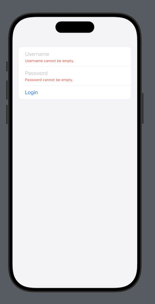
The result is shown below:

This custom modifier replicates live inline validation and error handling akin to Flutter’s validator functions while retaining SwiftUI’s declarative elegance. It provides a flexible and reusable way to manage real-time validation and on-demand validation triggers, making it a valuable addition to any SwiftUI developer’s toolkit.
By learning from other frameworks and applying those insights, we not only expand our technical skills but also improve the user experience of our applications, demonstrating the versatility and adaptability of declarative UI development across platforms.
Model Validation Using Property Wrappers (Inspired from ASP.NET)
ASP.NET, a widely adopted web technology from Microsoft, is extensively utilized in enterprise applications. It provides developers with powerful tools to streamline client-side validation by decorating the model with attributes, as demonstrated in the example below:
using System.ComponentModel.DataAnnotations;

public class Product
{
    [Required(ErrorMessage = "Product name is required")]
    [StringLength(50, ErrorMessage = "Product name cannot exceed 50 characters")]
    public string Name { get; set; }

    [Range(0.01, 9999.99, ErrorMessage = "Price must be between 0.01 and 9999.99")]
    public decimal Price { get; set; }

    [Required(ErrorMessage = "Category is required")]
    public string Category { get; set; }
}
This allows developers to implement validation directly at the client-side model level, a technique that can be effectively applied in SwiftUI using property wrappers.
The first step is to create a view state specifically for the LoginScreen. Since this state is only relevant to the LoginScreen, it can be defined within the view itself, as demonstrated below:
struct LoginScreen: View {

    struct LoginState {

        var username: String = ""
        var password: String = ""
        var email: String = ""

        func validate() -> [String] {
            // validate the fields
            return []
        }
    }
}
Currently, the properties of LoginState do not use any property wrappers. Next, we will implement the Required property wrapper, which will enforce that a value is provided for the associated property.
@propertyWrapper
struct Required {

    private var value: String
    private let message: String

    var wrappedValue: String {
        get { value }
        set { value = newValue }
    }

    var projectedValue: String? {
        return value.isEmpty ? message : nil
    }

    init(wrappedValue: String, _ message: String) {
        print(wrappedValue)
        self.value = wrappedValue
        self.message = message
    }
}
The Required property wrapper accepts two parameters: value and message. The value refers to the property it decorates, while the message specifies the error message to display when the validation fails.
Now, we can apply the Required property wrapper to the properties in the LoginState and implement a validate function. This function will ensure that all decorated properties in the LoginState are validated successfully.
 struct LoginState {
        @Required("Username is required")
        var username: String = ""
        @Required("Password is required")
        var password: String = ""

        @Required("Email is required")
        var email: String = ""

        func validate() -> [String] {
            var errors: [String] = []

            if let usernameError = $username {
                errors.append(usernameError)
            }

            if let passwordError = $password {
                errors.append(passwordError)
            }

            if let emailError = $email {
                errors.append(emailError)
            }

            return errors
        }
    }
The usage in shown below:
@State private var loginState = LoginState()
@State private var errors: [String] = []

    var body: some View {
        Form {
            TextField("Username", text: $loginState.username)
            TextField("Password", text: $loginState.password)
            TextField("Email", text: $loginState.email)

            Button("Login") {
                errors = loginState.validate()
                if errors.isEmpty {
                   // perform login
                }
            }

            if !errors.isEmpty {
                ForEach(errors, id: \.self) { error in
                    Text(error)
                }
            }

        }.navigationTitle("Login")
    }
The loginState.validate function performs validation on the form fields and returns an array of error messages for any invalid inputs. If the array contains error messages, it indicates that the form is invalid, and the errors are dynamically displayed on the screen. This ensures users receive immediate feedback on missing or incorrect fields before proceeding.
This approach offers developers greater flexibility, as they can introduce new property wrappers to handle additional validation requirements as needed. For example, the RegularExpression property wrapper, shown below, can be used to validate a property’s value against a specified regex pattern.
@propertyWrapper
struct RegularExpression {

    private var value: String
    private let pattern: String
    private let message: String

    var wrappedValue: String {
        get { value }
        set { value = newValue }
    }

    var projectedValue: String? {
        // Validate the value against the regular expression pattern
        if !matchesPattern(value) {
            return message
        }
        return nil
    }

    // Helper method to validate the value against the pattern
    private func matchesPattern(_ value: String) -> Bool {
        guard let regex = try? NSRegularExpression(pattern: pattern) else {
            return false // Invalid regex pattern
        }
        let range = NSRange(location: 0, length: value.utf16.count)
        return regex.firstMatch(in: value, options: [], range: range) != nil
    }

    init(wrappedValue: String, pattern: String, message: String) {
        self.value = wrappedValue
        self.pattern = pattern
        self.message = message
    }

}
The usage is shown below:
 @RegularExpression(pattern: "^[A-Za-z0-9._%+-]+@[A-Za-z0-9.-]+\\.[A-Za-z]{2,}$",message: "Invalid email format")
 var email: String = ""
Property wrappers offer a clean and efficient way for developers to separate validation logic from the rest of the code. This approach not only enhances code readability but also makes validation highly extensible, as new property wrappers can be introduced to address various validation scenarios with minimal effort.
What if you need to validate a property against multiple rules? For example, an email field that is both required and must match a valid email format. One approach to achieve this is by creating a Validation property wrapper that enables developers to pass an array of validation rules, making it easy to apply multiple validations to a single property. The implementation is shown below:
enum ValidationRule {
    case required(String)
    case regularExpression(String, String) // pattern and the message
}

@propertyWrapper
struct Validate {
    private var value: String
    private let rules: [ValidationRule]
    private(set) var errorMessages: [String] = [] // Holds validation errors

    var wrappedValue: String {
        get { value }
        set {
            value = newValue
            validate()
        }
    }

    var projectedValue: [String] { // Projected value for accessing errors
        errorMessages
    }

    init(wrappedValue: String, _ rules: ValidationRule...) {
        self.value = wrappedValue
        self.rules = rules
        validate()
    }

    // MARK: - Validation Logic
    private mutating func validate() {
        errorMessages.removeAll()

        for rule in rules {
            switch rule {
            case .required(let message):
                if value.trimmingCharacters(in: .whitespacesAndNewlines).isEmpty {
                    errorMessages.append(message)
                }
            case .regularExpression(let pattern, let message):
                let range = NSRange(location: 0, length: value.utf16.count)
                if let regex = try? NSRegularExpression(pattern: pattern),
                   regex.firstMatch(in: value, options: [], range: range) == nil {
                    errorMessages.append(message)
                }
            }
        }
    }
}
We have used variadic syntax in Validation initializer. This allows us to pass a single validation rule or a list of rules.
The ValidationRule enum centralizes all available validation rules in the application, providing a structured and reusable way to define validations. The Validate struct acts as the property wrapper, containing the validate() function, which executes the actual validation logic. For more complex validation scenarios, the logic can be refactored into a dedicated utility or service to ensure better organization and maintainability.
The usage is shown below:
struct LoginScreen: View {

    struct LoginState {

        @Validate(.required("Username is required"))
        var username: String = "johndoe"

        @Validate(.required("Password is required"))
        var password: String = ""

        @Validate(.required("Email is required"), .regularExpression("^[A-Za-z0-9._%+-]+@[A-Za-z0-9.-]+\\.[A-Za-z]{2,}$", "Email is in incorrect format."))
        var email: String = ""

        func validate() -> [String] {
              var errors: [String] = []

              if !$username.isEmpty {
                  errors.append(contentsOf: $username) // Access error messages
              }

              if !$password.isEmpty {
                  errors.append(contentsOf: $password)
              }

            if !$email.isEmpty {
                errors.append(contentsOf: $email)
            }

              return errors
          }
    }
This approach offers a flexible and scalable way to extend validation rules. It also enables you to encapsulate the logic into a reusable validation package, which can be easily imported into other projects for consistent and efficient validation.
Testing Validation Logic
Testing validation logic in SwiftUI views can be challenging because views are primarily declarative and don’t directly expose their internal state for testing. To address this, it is a best practice to separate presentation logic, such as form validation, from the view layer. By isolating the validation logic into a reusable helper or a dedicated model, we can make it independently testable and ensure that all edge cases are covered.
In this example, we’ll demonstrate how to refactor the LoginScreen view to decouple its validation logic into a LoginForm model. This approach enables us to write unit tests for validation scenarios without relying on the UI framework. We’ll outline the steps for extracting the validation logic, integrating it back into the SwiftUI view, and writing comprehensive unit tests to verify its correctness.
Here’s how you can achieve this:
Step 1: Extract Validation Logic
Move the validation logic to a separate extension or a struct that can be tested independently.
import Foundation

extension String {
    var isEmptyOrWhitespace: Bool {
        return trimmingCharacters(in: .whitespacesAndNewlines).isEmpty
    }
}

struct LoginForm {

    var username: String = ""
    var password: String = ""

    static func isFormValid() -> Bool {
        return !username.isEmptyOrWhitespace && !password.isEmptyOrWhitespace
    }
}
Now the isFormValid property in your LoginScreen can use this helper:
struct LoginScreen: View {

    @State loginForm = LoginForm()

    private var isFormValid: Bool {
        loginForm.isFormValid()
    }

    var body: some View {
        Form {
            TextField("Username", text: $loginForm.username)
            TextField("Password", text: $loginForm.password)
            Button("Login") {

            }.disabled(!isFormValid)
        }
    }
}
Writing Unit Tests
Test Cases:
- Both fields are empty → Invalid.
- Only
usernameis empty → Invalid. - Only
passwordis empty → Invalid. - Both fields are valid → Valid.
- Either field contains only whitespace → Invalid.
import XCTest
@testable import YourAppName

class LoginFormTests: XCTestCase {

    func testFormValidation() {
        // Test Case 1: Both fields are empty
        var form = LoginForm(username: "", password: "")
        XCTAssertFalse(form.isFormValid(), "Form should be invalid when both fields are empty")

        // Test Case 2: Username is empty, password is valid
        form = LoginForm(username: "", password: "password")
        XCTAssertFalse(form.isFormValid(), "Form should be invalid when username is empty")

        // Test Case 3: Password is empty, username is valid
        form = LoginForm(username: "username", password: "")
        XCTAssertFalse(form.isFormValid(), "Form should be invalid when password is empty")

        // Test Case 4: Both fields are valid
        form = LoginForm(username: "username", password: "password")
        XCTAssertTrue(form.isFormValid(), "Form should be valid when both fields are non-empty and valid")

        // Test Case 5: Either field contains only whitespace
        form = LoginForm(username: "   ", password: "password")
        XCTAssertFalse(form.isFormValid(), "Form should be invalid if username contains only whitespace")

        form = LoginForm(username: "username", password: "   ")
        XCTAssertFalse(form.isFormValid(), "Form should be invalid if password contains only whitespace")
    }
}
This setup ensures that LoginForm validation logic is thoroughly tested. Since LoginScreen uses LoginForm for validation, any issues with validation logic will be caught at the unit test level.
Conclusion
Validation is an integral part of building robust and user-friendly SwiftUI applications. From simple form validations to more complex scenarios involving inline feedback, validation summaries, and reusable components, incorporating these techniques ensures that your application processes accurate and meaningful data while enhancing the user experience.
In this guide, we explored a variety of validation patterns, including property wrappers, real-time validation, and inspiration from frameworks like ASP.NET and Flutter. These approaches not only demonstrate how to implement effective validation in SwiftUI but also highlight the importance of maintaining clean and reusable code for long-term maintainability.
By adopting these patterns, you can create applications that guide users towards providing valid inputs, reducing errors, and improving overall reliability. Remember, robust validation is not just about preventing errors—it’s about building trust with your users through thoughtful and intuitive design.
As you continue to refine your SwiftUI skills, don’t hesitate to experiment with and adapt these validation techniques to suit your app’s unique needs. With practice, you’ll be well-equipped to design powerful forms and create exceptional user experiences.
Looking for more in-depth SwiftUI learning? Explore courses at AzamSharp School and take your iOS development skills to the next level!